The Average American Diet
Unfortunately, Americans have some of the worst diets
in the world, and everyone else knows it. With the average American
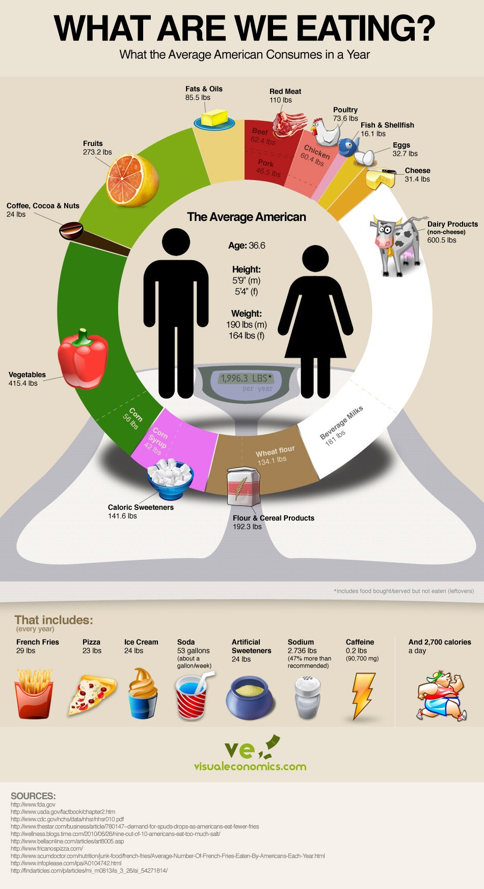
consuming 24 lbs of artificial sweeteners, 29 lbs of french fries, and
over 600 lbs of dairy per year, the average American is in a state of
crisis. The average American diet is heavily
responsible for the escalating obesity rates and is ultimately
contributing to the development of illness and diseases.
According to the below infographic, the average American consumes
about 1 gallon of soda per week, which equates to more than 18 fluid
ounces, or 1.5 sodas per day. These sodas are loaded with sugar, with a
12oz can containing 35-45 grams – an amount that exceeds the recommended daily intake of ~15 grams. What’s more, these sugars are typically in the form of high-fructose corn syrup, one of the cheapest, and most health-hazardous forms of sugar that can be used.
Another concerning number in the average American diet is the amount
of artificial sweeteners consumed; this includes substances like aspartame,
Splenda, Sweet N’ Low, and Equal. None of these artificial sweeteners
are healthful, and are even having a negative impact on your health.
- One study found that 67% of female rats exposed to aspartame developed tumors roughly the size of golf balls or larger.
- Is Splenda safe? This toxic sweetener also has many dangers. Some effects associated with Splenda are shortness of breath, joint pains, eye irritation, swelling of facial muscles, ski breaking out into hives or rashes, and more.
- Saccharin, best known as Sweet ‘N Low has been shown to have carcinogenic links. During the 1960′s, studies on rats indicated saccharin was related to bladder cancer, but the FDA has allowed saccharin to remain as a food additive.
Needless to say, there are many more problems associated with the
average American diet. While consumption of food shown in weight (as the
inforgraphic shows) isn’t the absolute best way to pinpoint the issues
with any diet, the numbers do give us a representation and idea of how
much we’re eating. If you want to compare generalizations between
nations around the world, take a look at what the world eats.
Check out the infographic below for some startling statistics.
Source: http://naturalsociety.com/average-american-diet-infographic/
Source: http://naturalsociety.com/average-american-diet-infographic/


No comments:
Post a Comment